This not-for-profit jazz dance company reached out to me for support in marketing collateral for their annual events.
The vision of Inaside Chicago Dance is to enrich the art form of dance by nurturing the dancer as a performer, choreographer and teacher and by making dance accessible to all ages through performances, workshops and outreach.
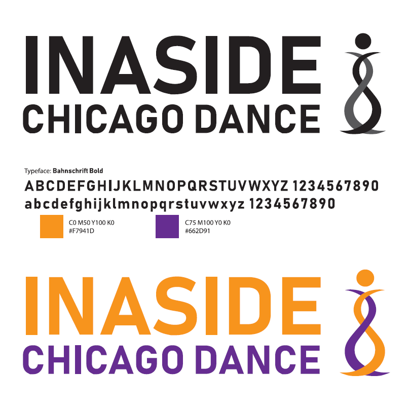
The company’s repertoire has evolved since its inception with works from diverse choreographers ranging the spectrum of jazz. To continue evolving they wanted to refine their current logo to a more professional mark.
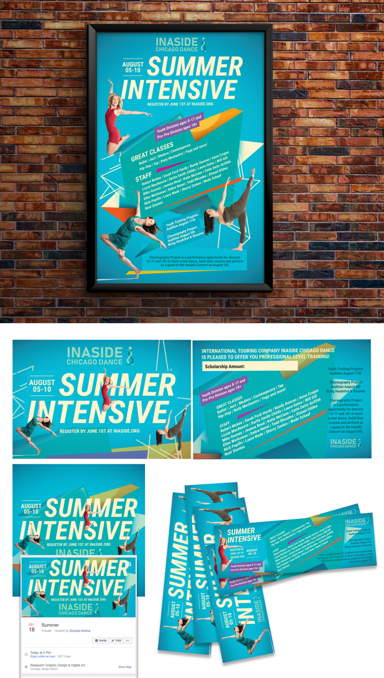
Print Collateral
The purpose of the projects was to celebrate the studios’ journey and achievements throughout the years. So with that purpose, we wanted to come across as a professional and mature dance studio with some creativity flare.
Logo redesign
When Inaside reached out to me they wanted a redesign of their current logo “to be classic and professional but a little fun and edgy.” They also did not want a new concept, but a refined mark. What I called it was a “facelift” which fit perfectly within their budget for now.
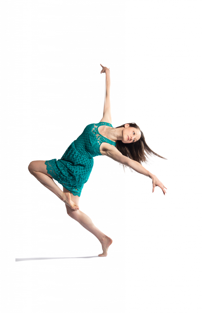
With their redesign, they also wanted a splash of refreshing graphic design to fit their evolving needs and to honor their current audience and dancers.
Something fun and colorful for the younger audiences, but at the same time professional and mature to translate into the trustworthiness of the classes and the events they would be hosting to promote these wonderful events.
I love I had the chance to work with this organization which shares the love of dance with youth to adults. Programs like this help our communities and spread joy. 💗